

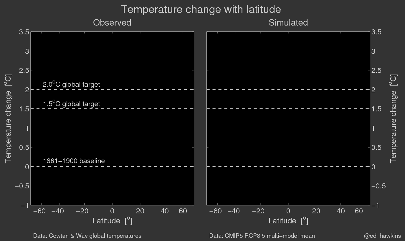
This interactive climate-change chart dramatically illustrates humanity’s predicament and provides an easy way to understand what is happening. (Thanks to Jim Bishop for sending it to me.)
http://www.climate-lab-book.ac.uk/files/2017/05/zmALLRCP85.gif
On the left are measured temperatures to 2016; on the right are the results of computer simulations. After 2016, the computer simulations show us the likely result of present trends unless we make immediate changes.
